Skip to navigation
Skip to content
[email protected]
+91-9810566442
MENU
TechZilo
Electronic Components
Search for:
Search
₹0.000
0
Home
Products
Electronic Components
Capacitors
Ceramic Capacitors
Electrolytic Capacitors
Diodes
AUTOMOTIVE BUTTON DIODE
BLOCK DIODE
IRI Metal Diode With Lead
TIN CAN DIODE
Ferrite Cores
EE Cores
EC Cores
EI Cores
I Cores
IC
Peizo Elements
Resistor
Carbon Film Resistors
1/4W CFR 5%
1/2W CFR 5%
SMD Resistors
0805-5%
Relays
Solder
Solder Rod
Solder Wire
HXD Buzzer
Solder Equipments
Accessories
Electric Soldering Iron Handle
Soldering Iron Stand
Heater
Soldering Tip
BOND Solder
Bond Lead Free Solders
Bond Solder Sticks
Bond Solder Wire
Bond Pure Anodes & Tin Anodes
Bond Solder Paste
Bond Soldering Fluxes
Bond PCB Chemicals
Soldering Tools
Handle accessories
Instrument
Soldering Station
BAKON
CXG
HOKI
QUICK
Soldering Bits
Direct Iron Bits
Temperature Control Bits
200M Series
500M Series
900M Series
T12
T18
T20
Weller Bits
Soldering Iron
Direct Iron
Temperature Control Iron
Soldering Elements
Direct Iron Elements
Temperature Control Elements
Soldering Cleaning Spung
Soldering Iron/Station Lead
Soldering Materials
Dross Reducer
Soldering Wire
Soldering Stick
Soldering Paste
Soldering Flux
Soldering Thinner
Soldering Ipa
SMT Glue
Electric Screwdriver
Ionizer Blower
Other Products
Mobile Repair Accessories and Tools
LCD repair machine
Rework Station
Soldering tools & Consumables
Soldering station
Soldering Iron
Tweezers
Screwdriver
Tape & glue
Brands
AEC
BOND Solder
Bakon
Chipown IC
DK IC
DP IC
Hornby Diodes
IRI
JWCO
SI IC
Shenle Relays
SUP
YF Solder
Relife
Sunshine
Quick
HXD Buzzer
HCW IC
Shop
Blog
Videos
Araldo Audio
Beeta Seven Audio
DJ News and Technology
Gadgets Emporium
Honey Jain
India Ka Bazar
My Bharat Bazar India
My Bharat Bazar
Puyung Audio
Veeru Vlog
Contact Us
₹0.000
0
Home
/
Technology
/
Arduino Technology in Transforming IoT Projects
/
Arduino Technology in Transforming IoT Projects
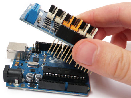
Arduino Technology in Transforming IoT Projects
January 26, 2020
January 26, 2020
Leave a Reply
Cancel reply
You must be
logged in
to post a comment.
Recent Posts
Best Photo Printers in India in 2020
Best 20000 mAh Power Banks in India in 2020
Best Air Purifiers in India in 2020
Best Landline Phones in India in 2020
Best Gaming Laptops Under Rs. 50,000 in India
Categories
Technology
Archives
April 2020
March 2020
February 2020
January 2020
May 2013
April 2013
March 2013
February 2013
January 2013
December 2012
November 2012
October 2012
September 2012
August 2012
Subscribe TechZilo Newsletter
First name or full name
Email