WordPress is the most popular blogging software right now, and will continue to be so for some time, thanks to the open-source community. The mass exodus of users from Movable Type began when MT’s makers decided to make it paid and restrictive in nature. Since then, WordPress users have not had to look back.
However, being open-source usually presents some strange problems, which are typical to all things open-source. UI design is one such aspect. Drab-looking, functional yet minimalist designs with only little colour and gradient variations are typical to open-source programs, and WordPress is no different.

Drab, sickening design
Colour combinations
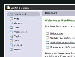
Looking at the WordPress administrative back-end where all the hard work takes place, all you can see is some blue backgrounds with white/black text, text entry fields and some rounded corners in widgets/boxes. There is no uniformity to inspire creativity in the blogger.
Colour schemes are awry, with the worst being blue text on blue background (talk about readabliity !) and black text on blue background. The sidebar modules look much better, though, with the rounded corners, hide/unhide using JavaScript and drop shadows.
Boxy model
The boxy nature of the design is all-pervasive, from the text fields to the upload area and the tabs on top.
Boxy tabs on top? What were they thinking? All of this reminds me of the Google homepage and its simplicity (which was once praised) which the users are tired of. Fast-loading pages are not the in-thing anymore, as most bloggers/techies have fast internet connections.
The least they could do is to make some rounded corners for the tabs, and a move away from the box model of 1990s.
Modules
‘Modules’ here refer to the boxes like Categories and Post Slug on the sidebar, and the Upload and Custom fields boxes below the post area.
Modules are better-looking (as compared to other elements). They have rounded corners, good colour combos (white text on blue background) and JavaScript-based hide/unhide feature. There is also other goodness like AJAX category input and custom fields, all of which make life better.
Faith, hope
WordPress is an excellent, young project, and can only move in the right direction. The introduction of widgets and better plugins went a long way in saving headaches for non-geeks. Better, inviting designs can only increase the newbie-friendliness. There was plans of a new “Shuttle” admin beautification project, which sported web 2.0 style and better design. However, the plans and hopes have been laid to rest now.
All is not lost, as the community has (again) come to the rescue. Several plugins have been developed, which beautifies the admin panel to a great extent. The only problem is that you will still stare at the plain design if you have re-installed WordPress upgraded (ie, you have to upload the plugin for every reinstall). Here are some good plugins to get started:
1. WP Tiger Admin
2. Spotmilk plugin.
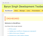
3. Brighten up with WP Barunio plugin.
WP Barunio (below)