More than a week after reporting about Google Analytics’ redesign, my Analytics account has finally switched over. Joy at last!
I had mentioned in that post that, if all the hype surrounding the redesign were to be true, Google Analytics would finally be a stand-out in the crowd of site statistics services.
The newly designed interface was available to users who signed up after it was unveiled. Loyal customers(that’s you and me) had to wait for some time.
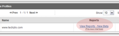
Today, when I logged onto the account, I was presented with this screen:
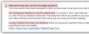
Instead of the regular “View Reports” link on the panel, I found a “View Reports Beta” link.
After putting the new interface through its paces, I can say that it is much better than the previous Design. There are no 4-box maps, with nothing but graphics, like the previous Design.
The new Design sports widgets, which can be dragged around and repositioned. Also, most of the graphs are accompanied by textual information, in case you don’t “get it”.
That, to me, is the killer. The old style of all-graphics, web 2.0 site just didn’t cut it. Now, thanks to a more usable Design, Google Analytics is better and badder than ever. Time for me to ditch all other services 😉